Josselyn

Access. Now.
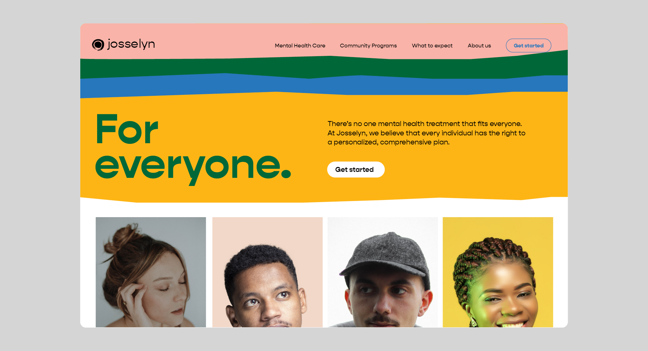
Josselyn has grown their talent and expanded their locations to be more than people realize. Through our brand exploration, we realized that we needed to shorten the name and proudly announce their reason for being—mental health for all.


Gone are the days when this was your only option if you were uninsured. Now Josselyn offers some of the best care in the area attracting insured clients whose payments help underwrite the costs of serving those who can’t pay. So we told the world. Or at least the surrounding area.
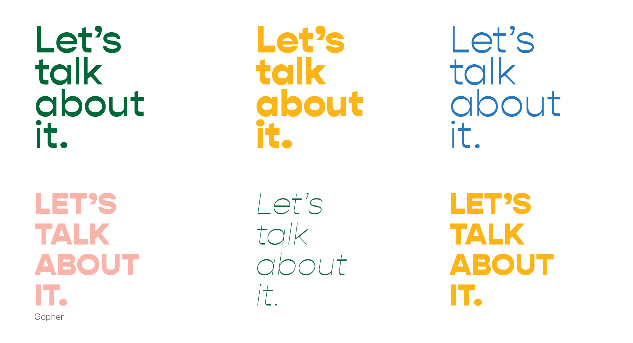
We kept Josselyn’s signature sun icon but freshened up the brand with a friendly and welcoming typeface and color palette.


We incorporated hand-drawn and paper cut illustrations and icons to make it feel even more personal and immediate. Then we applied this to the new, user-friendly responsive site.